
Branding and Creative Direction
ArtOps
Crafting a Visual System Where Art Meets Infrastructure
ArtOps is a marketing startup based in Seattle, Washington, that specializes in bridging the gap between promoters and artists. The ArtOps identity bridges the gap between creative expression and operational clarity. Inspired by the grundge scene of punk bands and shows and UX interfaces of apps like Spotify. The branding pairs a confident typographic approach with clean, modular layouts — flexible enough for shifting programming, but consistent enough to build recognition over time. A warm, grounded palette complements both analog textures and digital use, while the overall tone reflects a respect for the artist and promoter music scene. The result is a visual language that brings structure without sacrificing soul.


Early logo iterations for ArtOps, where I explored a wide range of directions — from bold and gritty to clean and structured. The goal was to capture the raw, DIY energy of the Seattle music scene while introducing just enough refinement to feel intentional and versatile. These studies helped set the tone for a brand that’s both rebellious and ready for the spotlight.

A homepage mock-up featuring hero imagery and brand language to demonstrate how the identity comes to life in a real-world context.
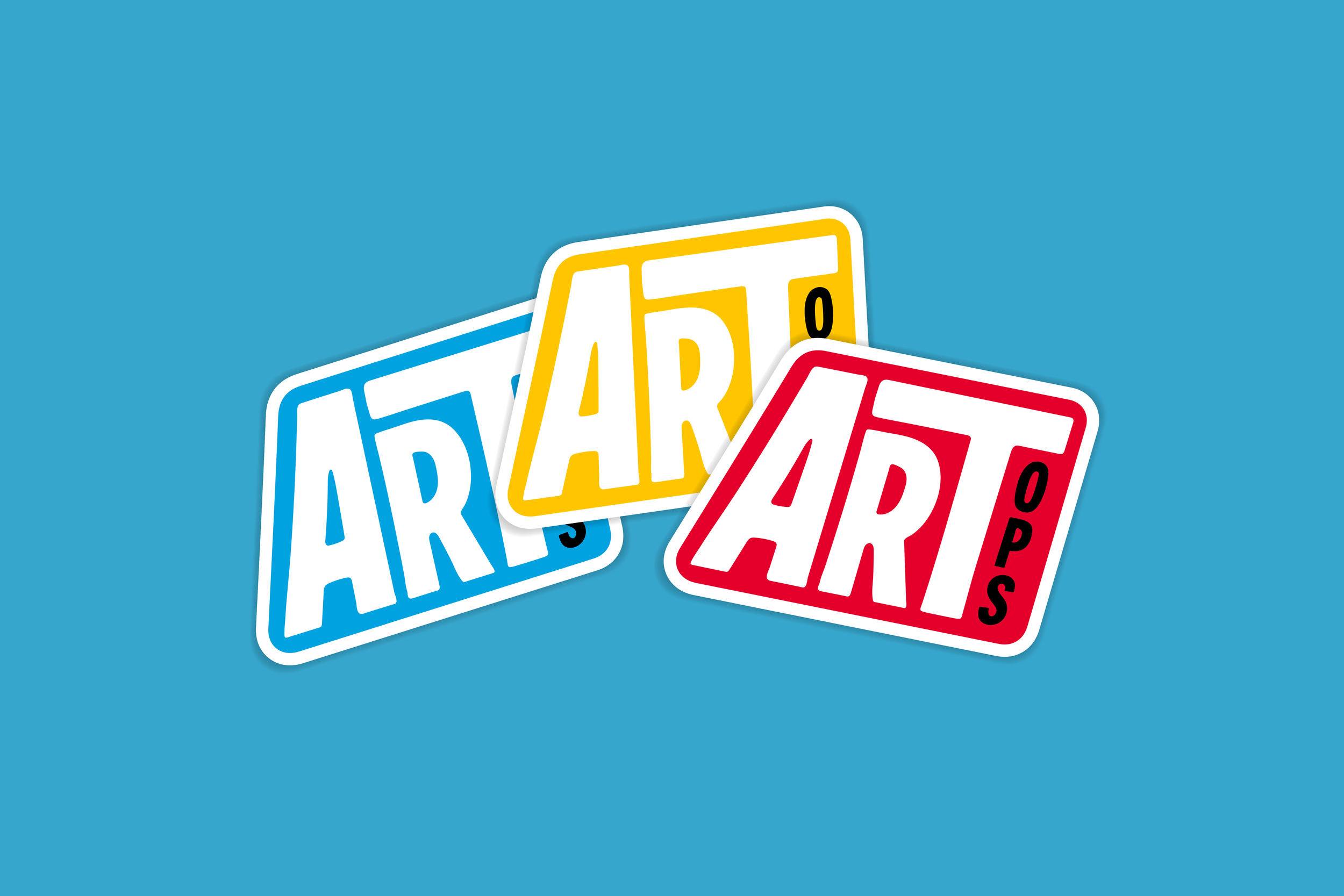
Sticker designs using an alternate lock-up of the logo in different brand colors.

What the sticker would look like in the wild.

The final ArtOps mark strikes a balance between underground energy and modern polish. Bold, condensed letterforms channel the spirit of DIY show posters, while clean lines and a flexible color system give it room to grow. It’s a brand that’s loud, confident, and built to move — just like the artists it represents.